Drawing New Meaning
Much before Satyajit Ray became iconic for his path-breaking films, there was a legacy of fine art that existed and continued to flourish and inform his film making journey through his inventive posters, cover designs, illustrations and use of calligraphy
Suzanne McNeill
I miss the movie posters that lined Anna Salai in Chennai. We saw the huge painted billboards advertising Tamil films every day on our way to work. They were bold, garish and fun, with figures that were larger than life. A thousand miles north, the city of Kolkata has a distinct legacy of movie poster art that is as unique to its traditions of regional film-making as Chennai’s hoardings were to Kollywood. It is embodied in the work of Bengal’s most influential filmmaker, Satyajit Ray (1921–1992), a creative genius who also worked as an illustrator, graphic designer and typographer. Ray made films that showed a deep and enduring connection between his sensibility as an artist and the possibilities of cinema, honed by years of experience that was both pioneering and practical.
At only 30 years old, Ray was already Bengal’s outstanding commercial artist. He was art director at an advertising agency called DJ Keymer, where his artistic talents and willingness to experiment had already brought him recognition and success. His passion for the art of cinema was certainly present – in 1948, Ray was one of the founders of the Calcutta Film Society, set up to cultivate a greater awareness of film as an art – but it was as an illustrator and graphic designer that he was forging his career.
This course seemed a natural progression, for printing had been the business of his highly cultured family. In 1895, Ray’s grandfather, Upendra Kishore Ray, had founded a printing firm, setting himself up as Kolkata’s first high-quality process engraver. The business was run from the house in which Ray was born, with the ground floor given over to the printing presses, and the compositors and block-makers taking up the first floor. The family lived in the back of the house. Ray was captivated by the equipment and activity of printing from his earliest days, recalling afternoons spent with the workers as a ‘fascinating experience’. One of the publications printed by the press was a children’s magazine of stories, riddles and drawings called Sandesh. It was started by Ray’s father Sukumar, himself a gifted artist and writer and the magazine’s chief contributor and illustrator. The young Ray would present the camera operator with his drawings, announcing, ‘This is for Sandesh’. He helped his grandmother clean and sort old picture blocks, leafed through European books of paper samples with their wonderful range of textures, and was fascinated by the work of his great-uncle, who dealt with photographic enlargement.
Persuaded by his mother, Ray studied fine arts at Santiniketan, the pioneering college founded by Rabindranth Tagore where music and art were valued alongside academic pursuits. Here, Ray was taught by two of India’s celebrated modern artists, Nandalal Bose and Binode Bihari Mukherjee, and befriended the painter-sculptor Prithwish Neogy. Ray credits all three as instrumental in instilling him with a love of Indian classical art, reinforced by a tour he took in 1941 to see the great masterpieces for himself. He visited Ajanta, Ellora, Elephanta, Sanchi and Khajuraho, assimilating the qualities that distinguish Eastern from Western art. Critics note that this awareness sharpened his perception of the way very small details in Indian art could be used to express something much greater, and Ray himself observed that ‘film directors can learn a lot from these pictures’.
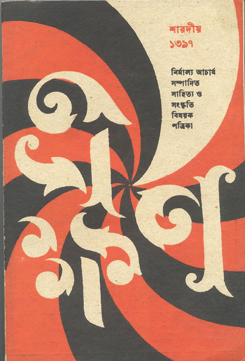
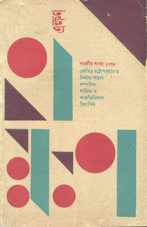
He also brought to his work a fascination with typography, both Bengali and English, which was to surface regularly in his later publishing and film works. The calligraphic tradition is old in India, but was not used in advertising art until Ray introduced it. He played with the letter forms of Bengali words, notably creating a series of cover illustrations for the literary magazine Eksan (‘Now’) that were simply graphic variations of the title lettering. He designed four original English typefaces, two of which, Ray Roman and Ray Bizarre, he entered into an international competition. Whilst they didn’t win, they were selected for marketing purposes, and Ray earned royalties on them. When he took up writing detective stories, Ray’s fictional detective, Feluda, was to use his knowledge of typefaces to start unravelling the mystery in Feludar Goendagiri.
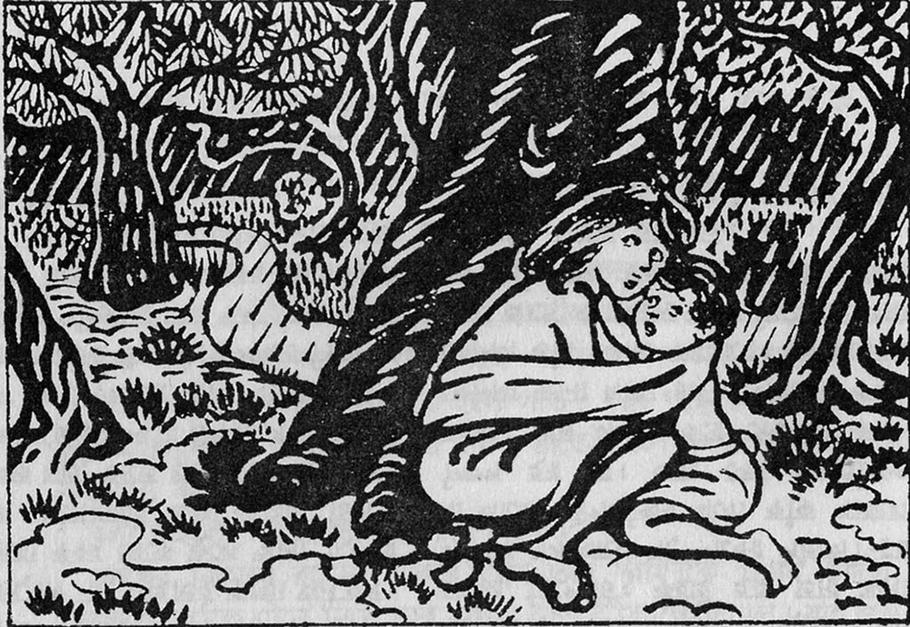
At the same time as working for Keymers, Ray was employed as a visual designer for a Bengali publishing house called Signet Press. The publisher, DK Gupta, wanted to do something original with the cover designs of his publications and Ray was given a completely free hand. He introduced Indian elements, colour schemes and compositions into the artwork, revolutionary contributions that gave the Press’s publications a distinctive look, evoking the essence of the books through their cover designs. Rather than depict an episode or character from the novel, standard practice at the time, Ray conceptualised the design, illustrating Raj Kahini, a collection of tales about the Ranas of Chittor by Abanindranth Tagore, in the style of traditional miniature Rajasthani paintings. A translation of Jim Corbett’s adventure classic The Man-Eaters of Kumaon was given a wrap-around cover showing the striped pelt of a tiger with bullet holes on the front and back – the exit wound wider than the entry wound, telling us much about Ray’s eye for detail – and the writer, publisher and blurb appear in the holes. His cover design for The Discovery of India, written by Jawaharlal Nehru, is classically elegant, with a fading design of jali work overlaid by graceful lettering. Ray began illustrating books, too, drawing on traditional Bengali woodcuts and Kalighat pat art. The woodcuts he designed for an abridged version of the novel Pather Panchali for children show a simple vitality. Later, some of the scenes he created then, such as the children huddling together during the storm, were to find their way onto celluloid.
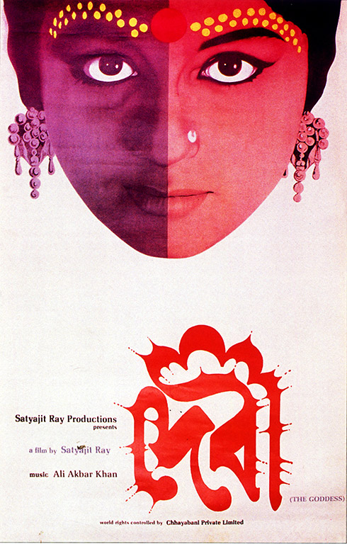
These illustrations for Pather Panchali were to prove a turning point in a career that was already multi-faceted: Ray was convinced that he should attempt to film the story. It took several years to fulfil his new ambition but the screening of Pather Panchali, the first of his Apu Trilogy, at the Cannes Film Festival in 1956 brought the fledgling filmmaker immediate critical and global recognition. Critics celebrated the sense of magical poetry in the film, one remarking that ‘the purity of the images corresponded to the purity of the subject’. Naturally, Ray turned his design skills to the publicity material that promoted his films, bringing a wide variety of styles and media to his work. The poster for Pather Panchali incorporated folk art and hand-drawn motifs, suggesting the simple life of the rural family at the heart of the story, their images framed by the circular alpana common to Bengal’s floor art. His posters cleverly distilled the themes and moods of his films into a single image: for the 1960 film Devi, in which a young woman is convinced she is the embodiment of the Hindu goddess Kali, the face of a girl is divided in two, light and dark, to suggest her split personality, and uses iconography typically associated with the goddess. The Bengali lettering is designed to suggest the goddess’s shrine. Ray used swift, calligraphic brush strokes to depict the central female character of his film Charulata, who gazes out with both confidence and longing. And he was bold with photography, creating montages that reflected contemporary pop art such as the illustrations of floating cut-out heads for the 1965 satirical film Mahapurush, and again for the drama Pratidwandi in 1970. This was set against the political turmoil and social unrest of the period, and the poster’s background and title block is correspondingly fractured. The poster for the 1970 film Aranyer Din Ratri depicts the forest to which four Calcutta urbanites retreat for a weekend in a stark, eerie design of black and white, with typography that shows an unnerving tremble.
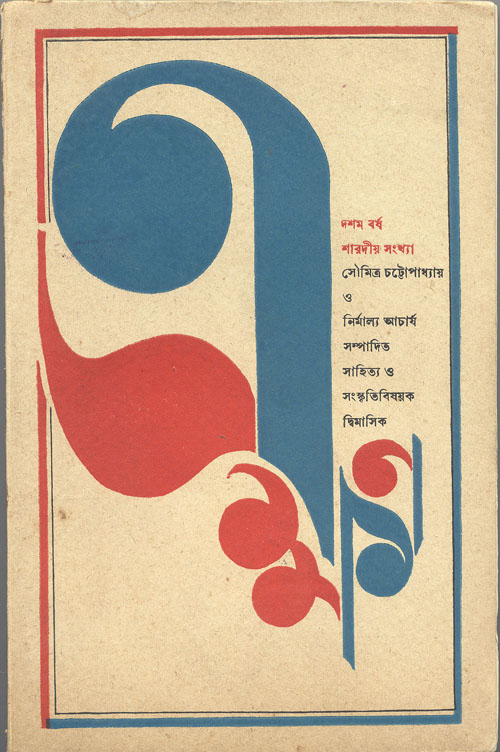
The Satyajit Ray Society describes Ray’s design process thus: ‘He would conceive of an image, then explore its inner significance, and then give it a realistic shape and form, finally corroborating it with the original image he had in mind.’ This refers to his illustrations, but could just as easily be applied to how the artist in Ray shaped the aesthetic of his filmmaking. Ray famously prepared his film scripts for Pather Panchali in the manner of comic strips, charting out a visual plan for his entire film rather than writing a screenplay. Earlier this year, a facsimile edition of Ray’s sketchbook of the film was published, which, alongside a collection of essays and reviews, reproduces his sketches against the corresponding film stills, a perfect example of the inter-relationship between the filmmaker and the artist.
Share